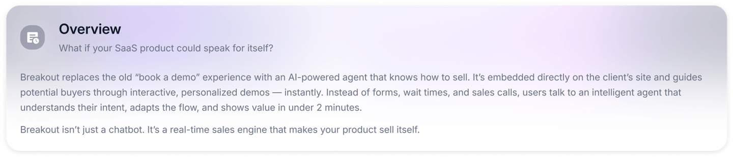
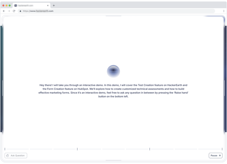
Turning Weeks of B2B Sales into Minutes with Immersive AI-DrivenDemos
An AI-powered assistant that turns your website into a live, self-guided product demo — without forms, friction, or sales teams.


Role: Lead Product Designer
Team Size: 12 people
The team included 2 founders, a product manager, a lead engineer, 2 frontend engineers, 3 backend engineers, a Gen AI specialist, a marketing lead, and 1 product designer (me).
I led the design side of Breakout from 0 to launch. I was responsible for strategy, research, interaction architecture, visual execution, and collaboration with engineers and stakeholders.
🎯 What I Did
Strategic Planning
Worked directly with the CEO to shape the product vision, define MVP boundaries, and prioritize feature scope around business and user needs.
Research & UX Mapping
Conducted interviews and facilitated discovery workshops to identify key friction points in SaaS sales. Built and refined user journey maps to guide experience design.
Interaction Design
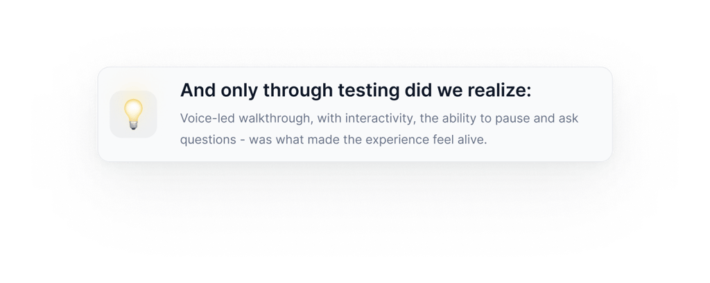
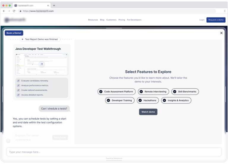
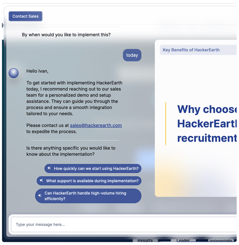
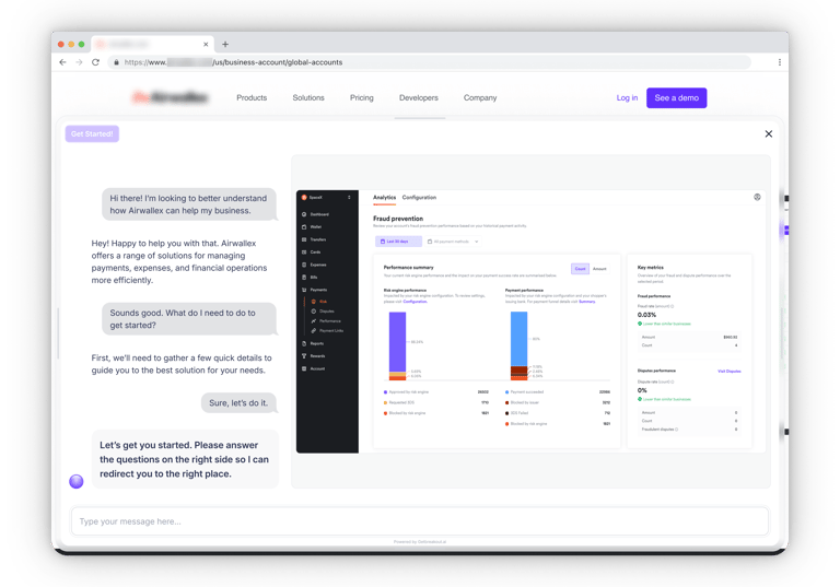
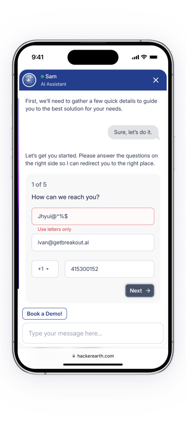
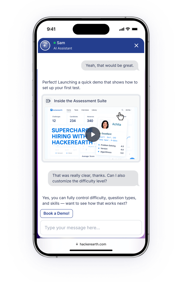
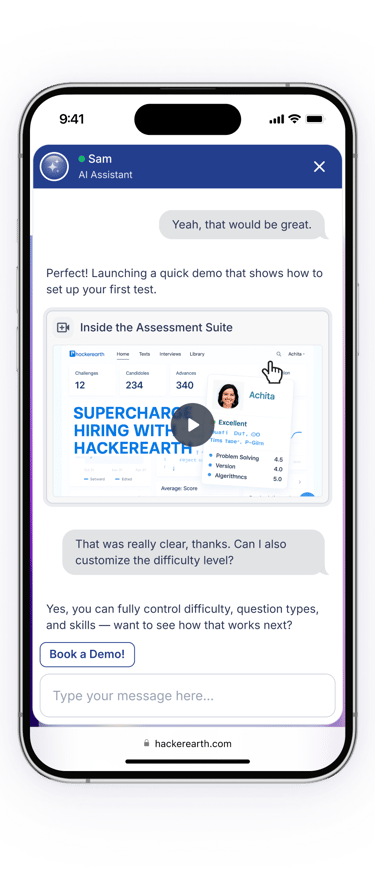
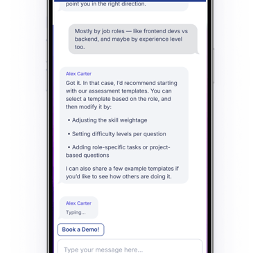
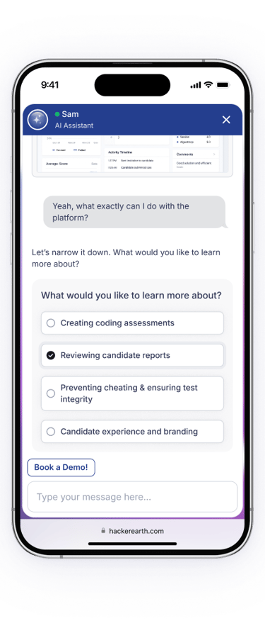
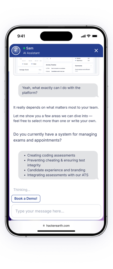
Designed conversation flows, fallback scenarios, and adaptive dialogue logic — including Immersive Mode, a voice-guided, real-time product walkthrough.
Design System Development
Created a modular design system with components, color tokens, and brand-adaptive visual logic that allowed seamless integration into any client website.
Visual Design & UI Execution
Defined UI principles for clarity, neutrality, and responsiveness. Designed multiple UI states for onboarding, deep interaction, and edge-case behavior.
Engineering Collaboration
Worked closely with frontend, backend, and AI engineers to validate ideas, align on technical constraints, and hand off complete design specs.
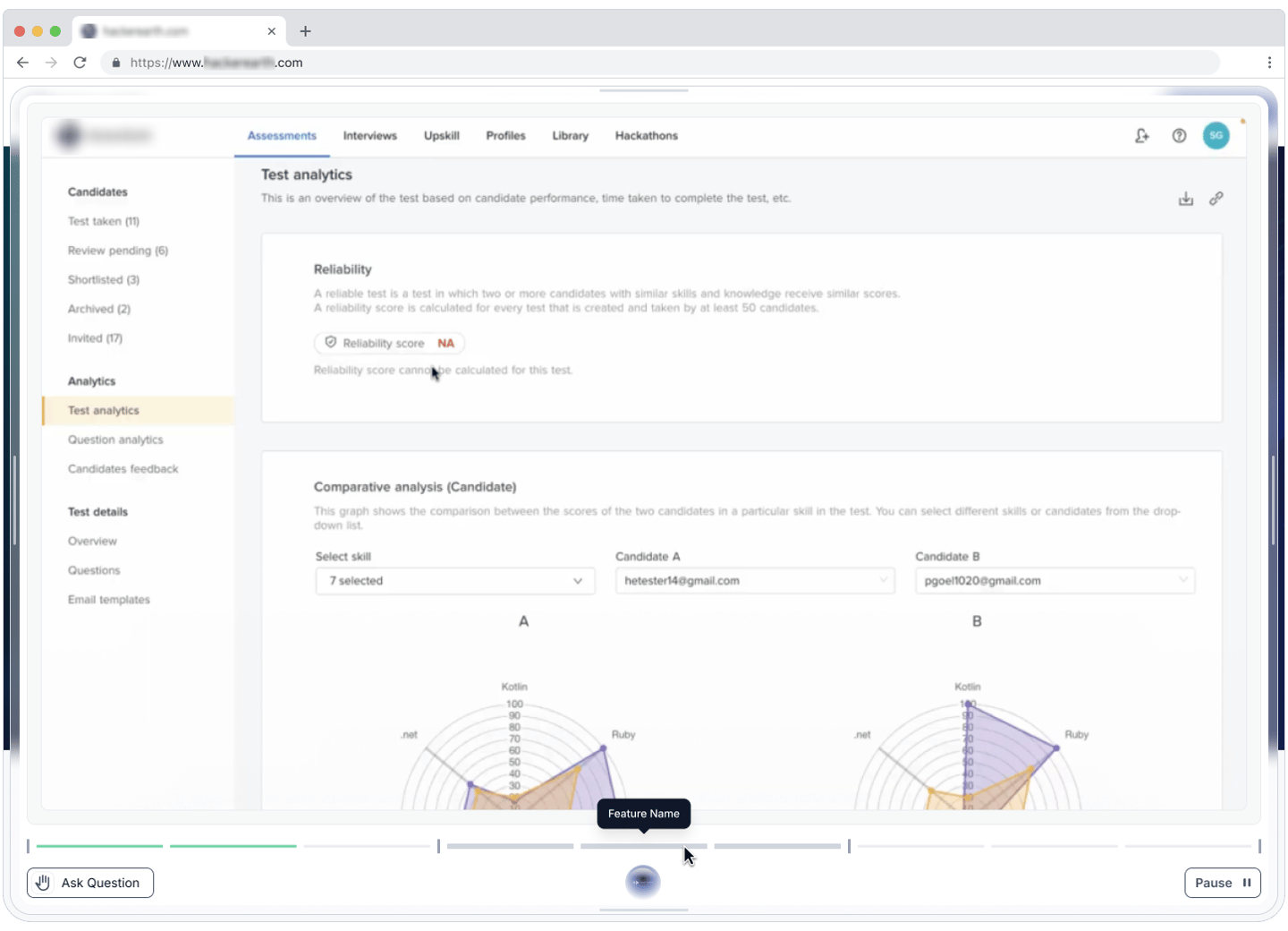
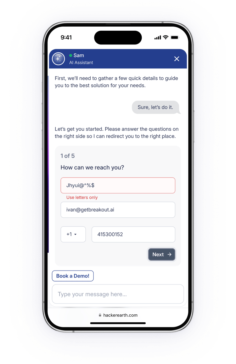
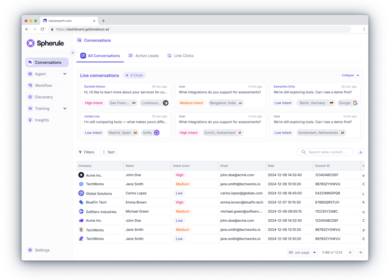
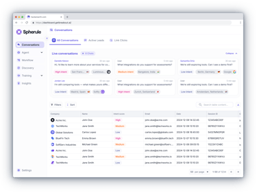
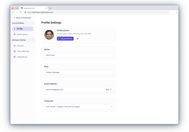
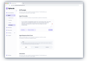
Admin Dashboard
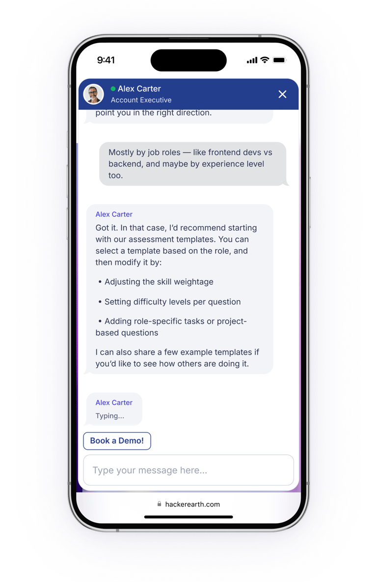
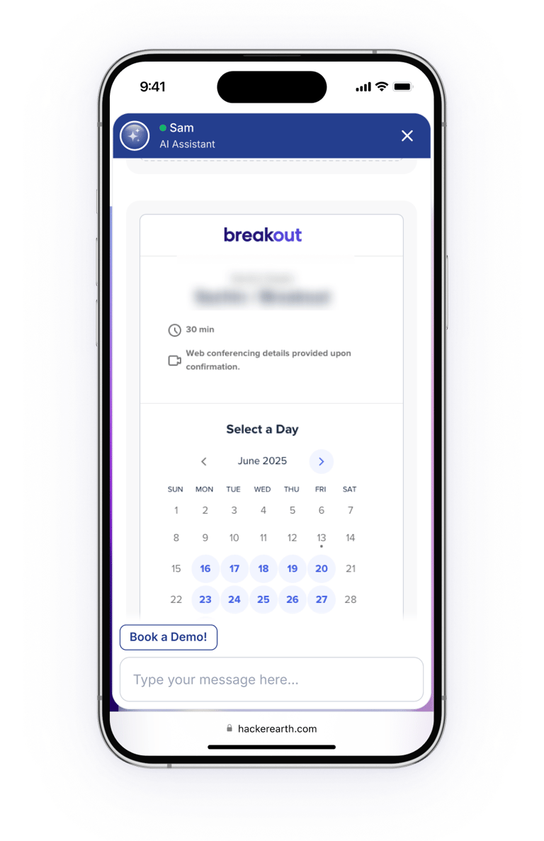
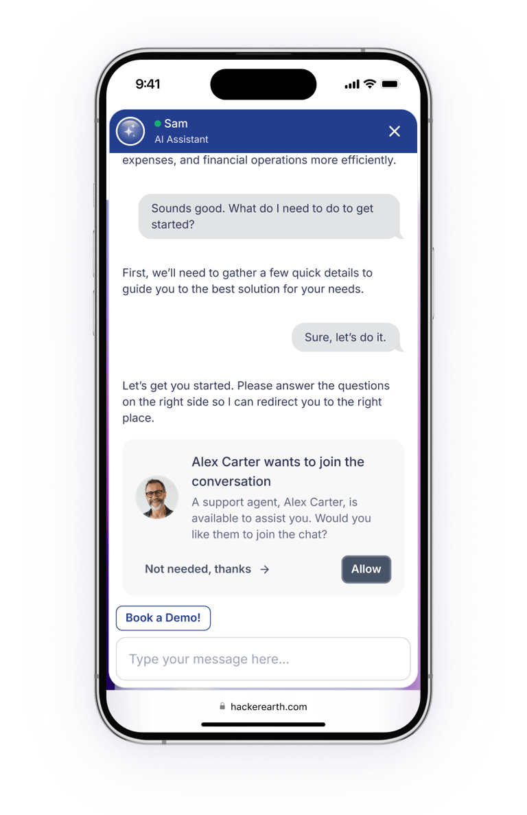
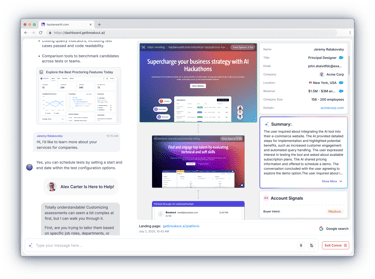
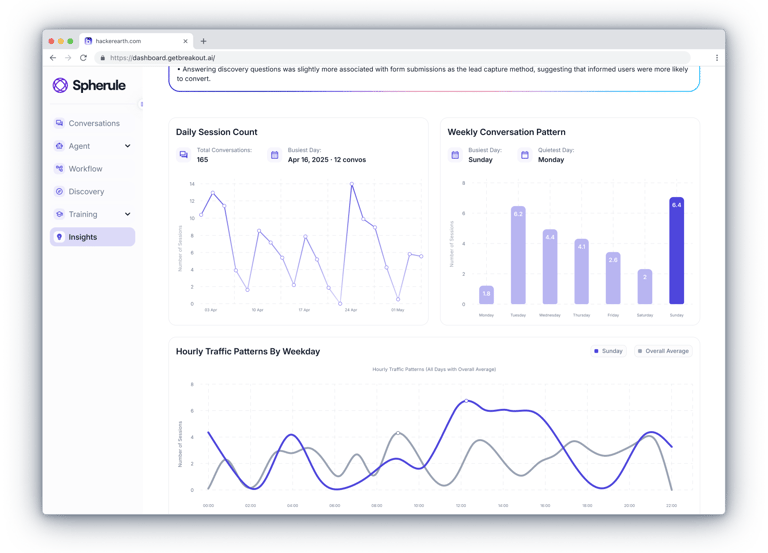
Designed a real-time admin interface that allows clients to monitor live chats, view user profiles, and join conversations with a single click.
📈 Product Impact
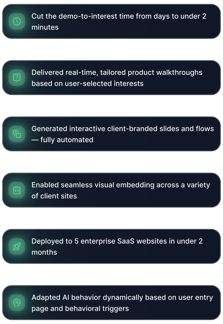
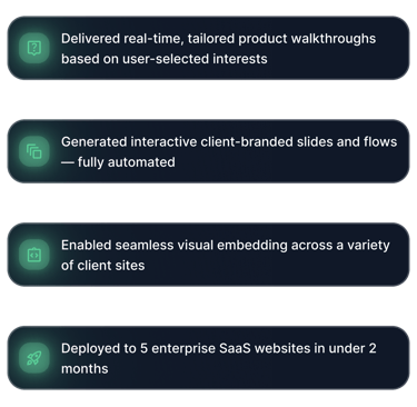

The traditional process of buying B2B software is broken...
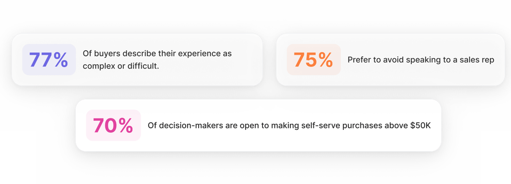
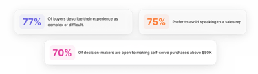


Still, most companies rely on outdated, manual sales funnels — lead capture forms, SDR handoffs, gated demos — with zero visibility into early user intent.
Buyers are forced to do all the work themselves, moving through research and qualifying steps solo, with 70%+ of the journey complete before sales even get involved.
Sellers are too late to influence. Costs go up. Funnels leak. Buyers just want to see what the product can do — right now.


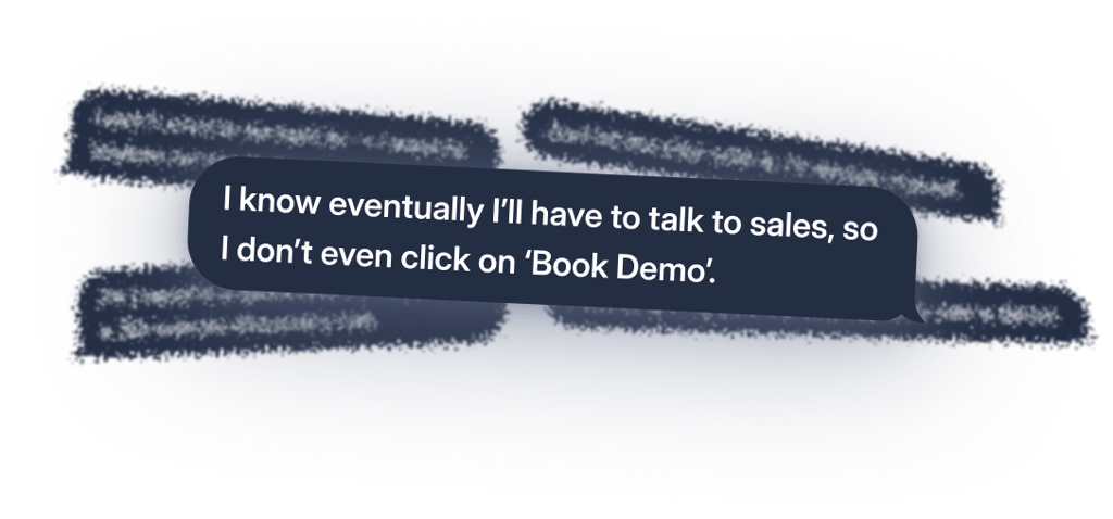
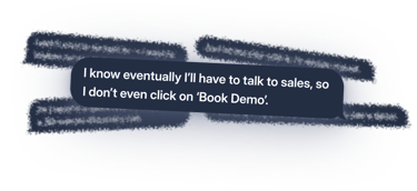
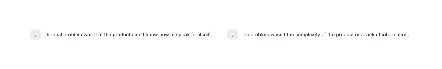
This quote from one of my initial interviews perfectly captured the problem.*
Before designing interfaces or AI architecture, I stopped and asked myself two key questions:
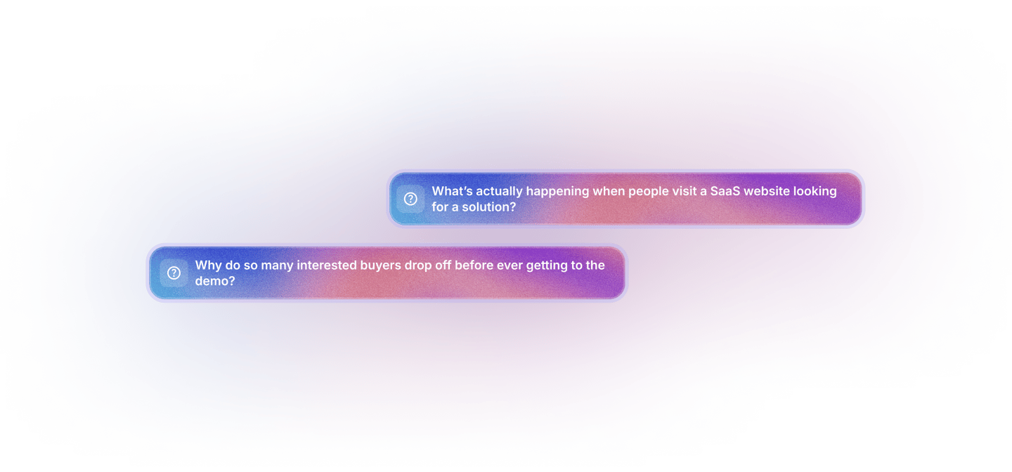
To find answers, I personally conducted in-depth interviews with various types of buyers: technical directors, procurement managers, team leads. I analyzed call recordings, captured their pain points, and studied their behavior patterns.


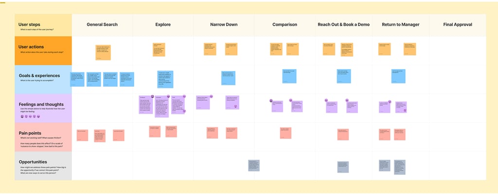
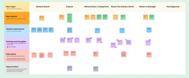
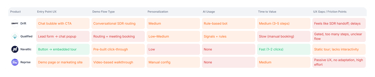
CJM #1: The Current Flow
Users start enthusiastically with general search but quickly sink into information overload and confusion.
They end up returning to their managers without any real confidence, saying, “I’m still not sure, maybe let’s just email them.”
Then come endless filtering, comparisons, and growing uncertainty.
Eventually, when they reach the “Book Demo” button, they’re faced with long forms, frustrating wait times, and broken follow-ups.
All of this helped me create two customer journey maps - one showing the reality, the other showing the ideal scenario.
The first journey map looked like a minefield:
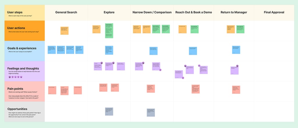
CJM #2: The Ideal Flow (with AI)
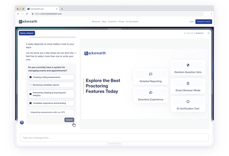
Users land on the website and immediately start a conversation with an AI.
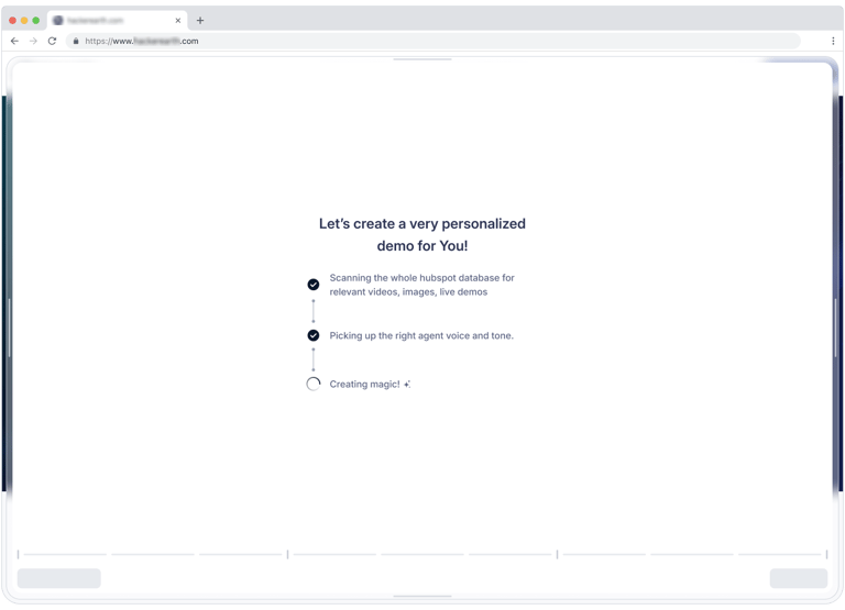
Every user action dynamically reshapes the content and the way information is presented, maximizing engagement and providing immediate answers.
Instead of generic information or static forms, they instantly receive a personalized demo presentation tailored exactly to their interests.
No waiting. No forms. Just clear, instant product value.
It became clear to me that more than 70% of the buying journey happens without any influence from the sales team.
Then I created the second map—a perfect scenario:

At the core of this ideal scenario was a typical user—Alex.
Persona: Alex Johnson
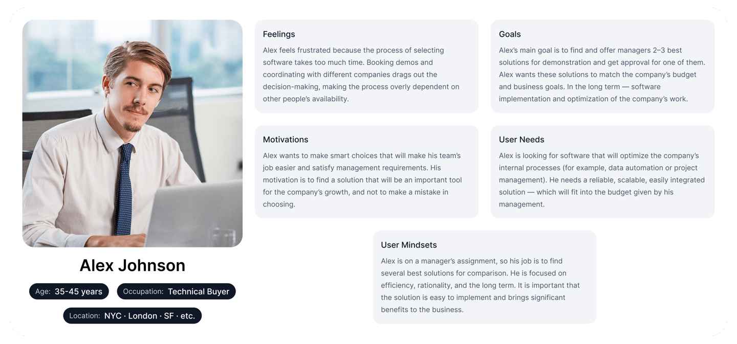
Alex doesn’t make the final decision, but heavily influences it. His goal is to quickly gather a few suitable options and present a confident recommendation to the team. He dislikes pushy sales tactics and prefers to explore independently. Alex wants to say, “Here’s the answer,” not “Let me ask them again.”
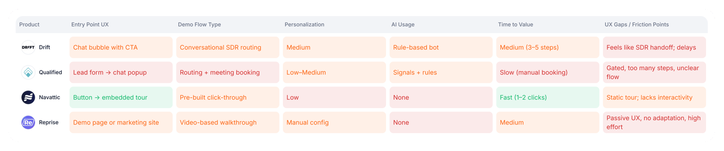
I conducted competitive research. Several solutions were improving onboarding, documentation, and chat features. But no one was addressing the critical “first-minute” problem—the moment when users are warm enough to listen but not yet convinced.
Then the key insight struck me:
Сompetitive research


Concept & UX Strategy
Users didn’t want to fill out forms, wait for emails, or schedule calls with sales reps just to understand how the product works.
But it was still just a theory.
Not only were we right — we had underestimated the pain.
Most people wouldn’t even click “Book a demo,” because they already knew what would follow: friction, wasted time, and loss of control.
We didn’t want to be just another chatbot.
We needed to rethink the format, find our own angle, define what made us different - and how we could create a product experience that showcases itself, closes intent faster, and actually helps people move forward.
When we started working on Breakout, we already had a hypothesis:
Through interviews, research, and building out a customer journey map, we realized:
That’s when we understood:
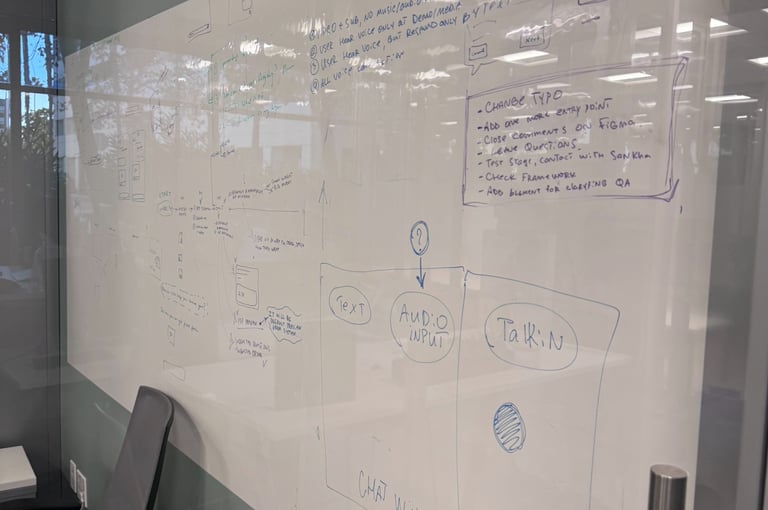
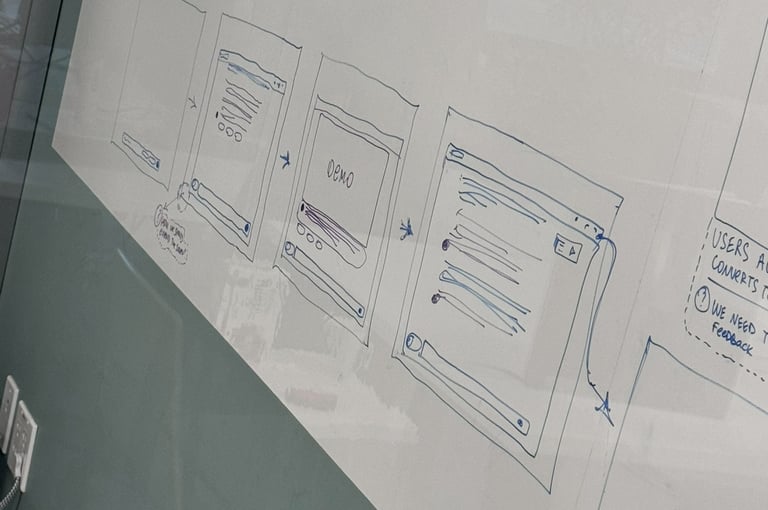
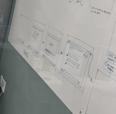
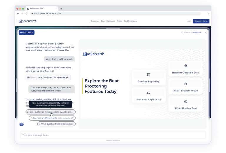
Exploring Different Concepts
Our early prototypes were simple — like everyone else’s.
A chat where you could ask a question and get an answer.
Support, but with AI, reasonable enough, but deep down, it felt like we were just re-wrapping an old mechanic in a new voice.
We didn’t want to just answer questions — we wanted to take the lead.
Not wait for users to act, but help them understand the product before they cooled off. That’s when a new type of interaction started forming.


We knew the user needed to land in the product experience immediately —
without confusion, hesitation, or wasted clicks.
The user flow didn’t come out perfect on day one.
It evolved as we tested hypotheses and watched behavior:
what stuck, what didn’t, what felt natural.
We realized:
— people aren’t coming to the site for a chatbot,
— they’re coming for an answer.
If we could offer that in the first few seconds, we’d win their attention.
The challenge was to find a balance between being noticeable and non-intrusive —
to make sure the entry point felt native and fit seamlessly into the site,
but still caught the user’s eye.
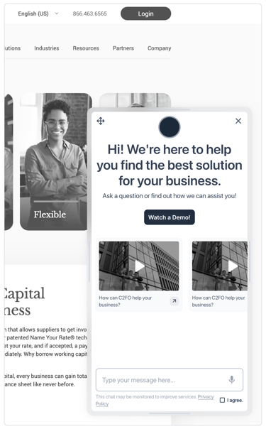
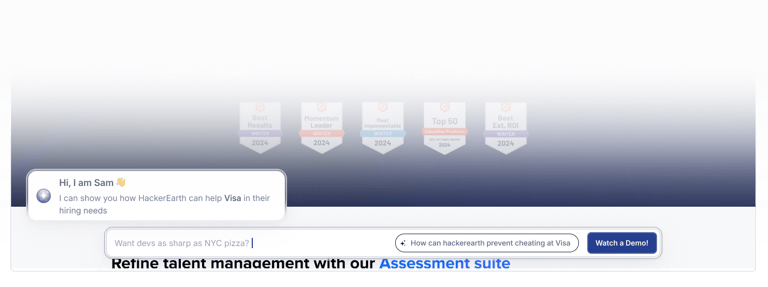
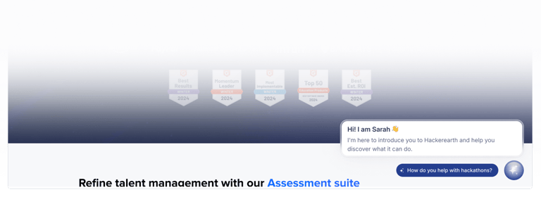
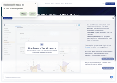
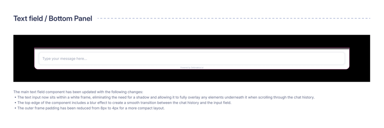
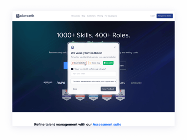
That’s how we landed on the animated BottomPanel and the Sam icon in the corner —
subtle but visible, quiet but inviting.
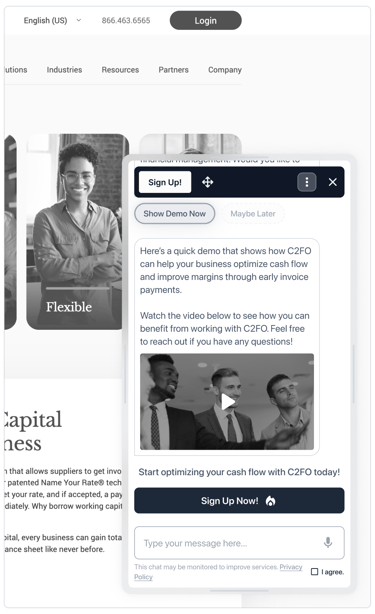
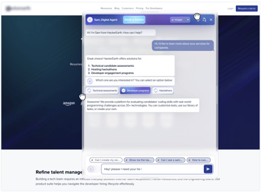
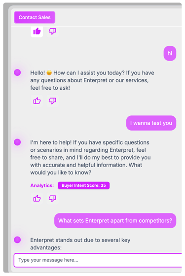
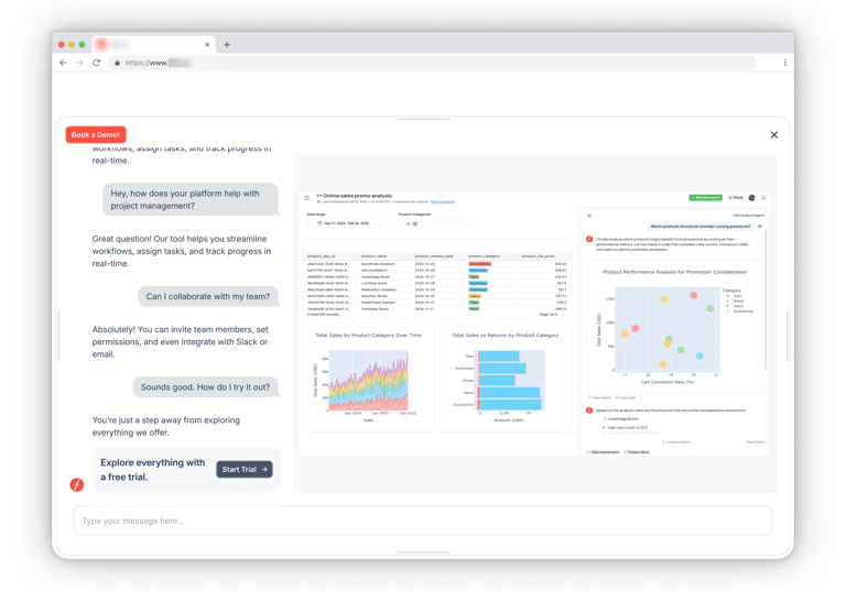
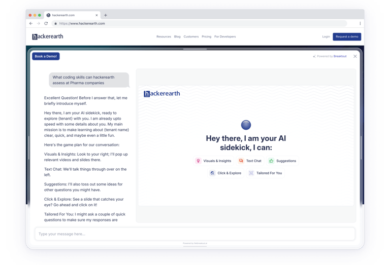
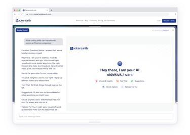
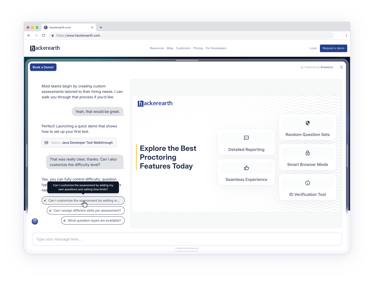
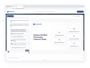
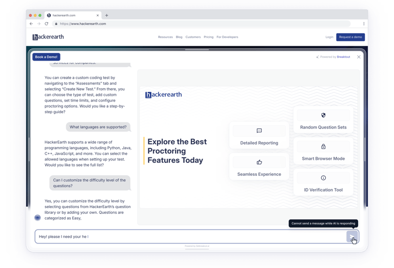
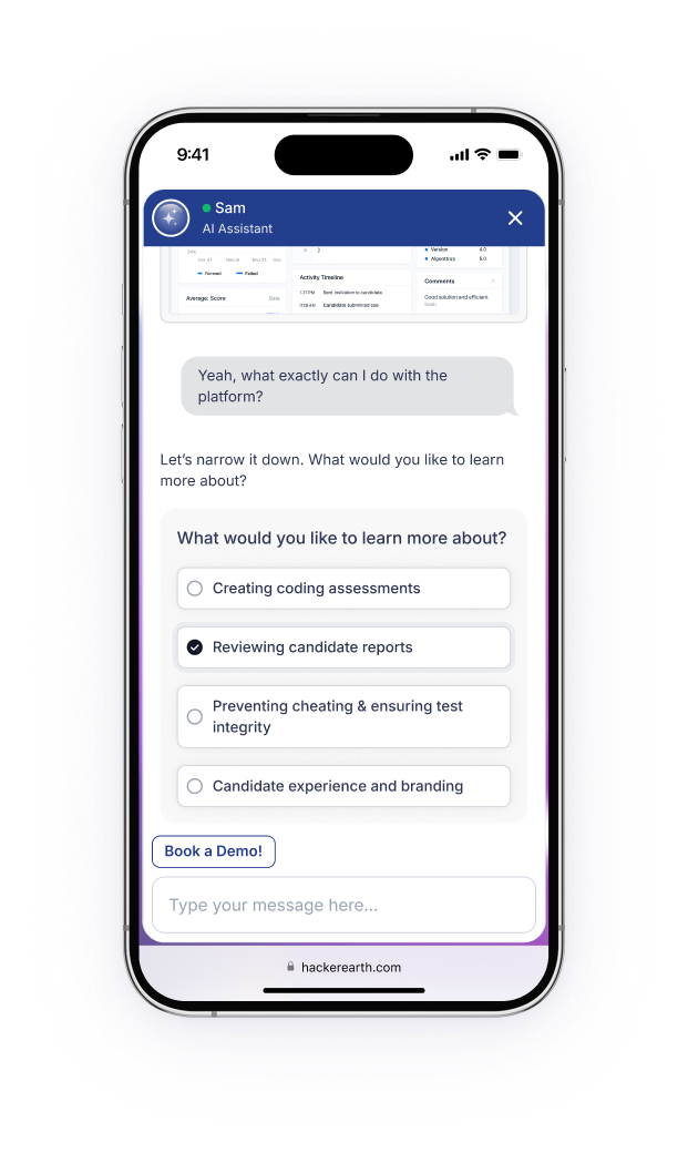
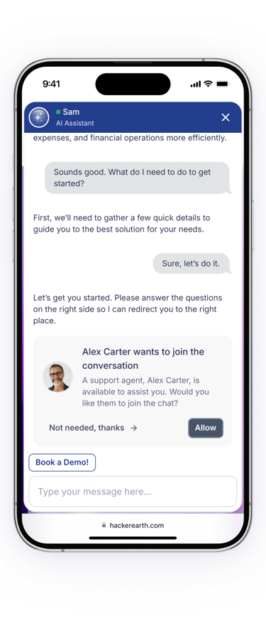
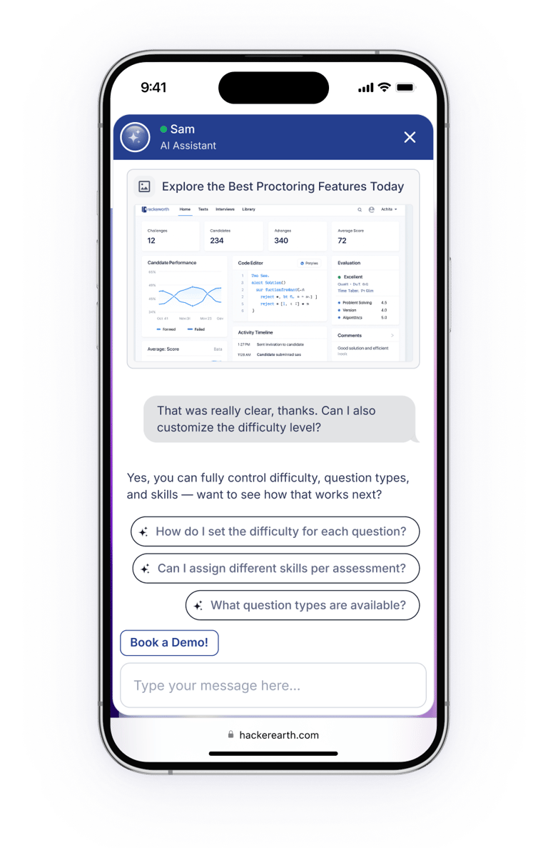
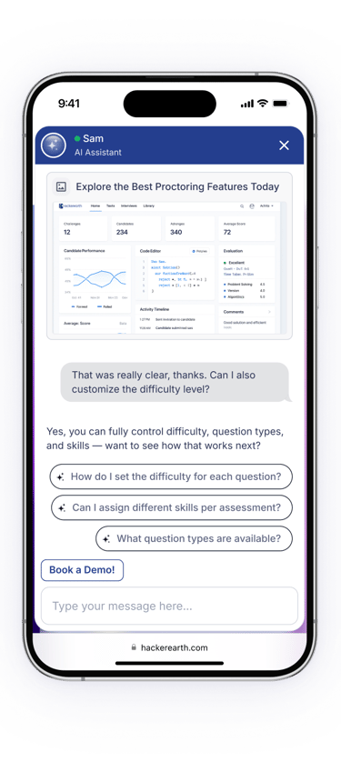
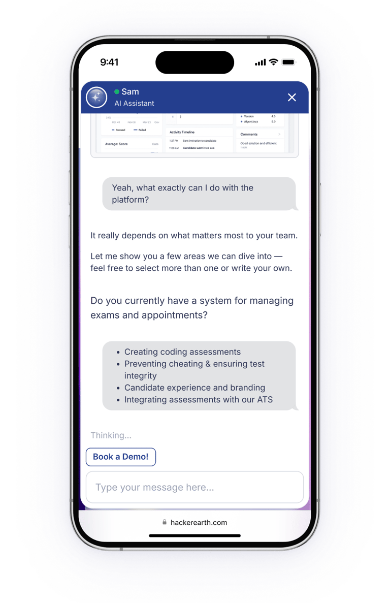
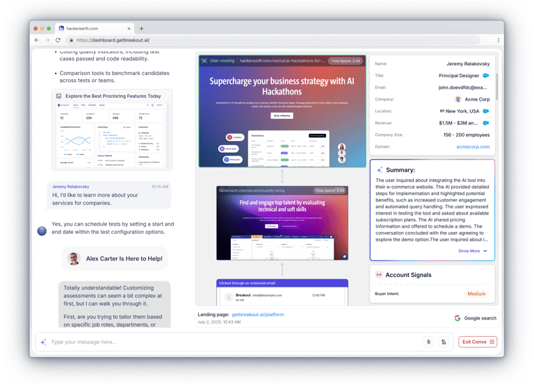
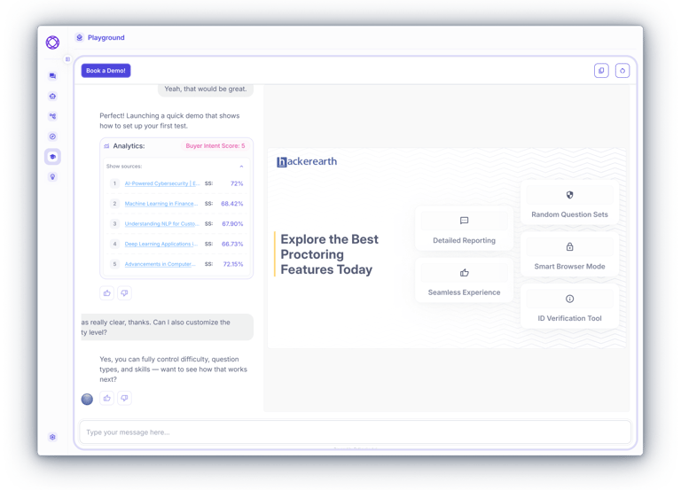
Once a user clicked, they didn’t get a “bot.”
They landed in a relevant, focused conversation —
and almost immediately, visual context kicked in:
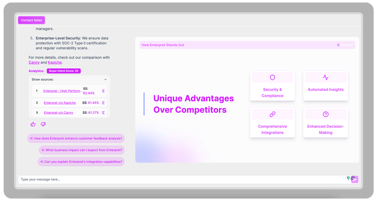
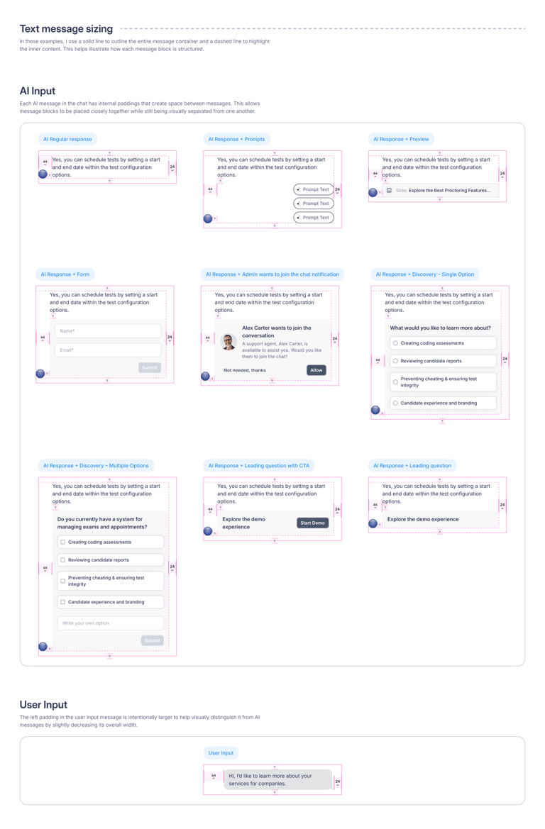
a slide, an image, a graphic — something that made the explanation feel real.
That became one of our strongest effects:
seeing what the AI meant,
instead of just reading.
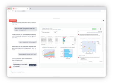
Designing the Experience


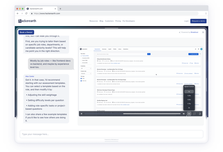
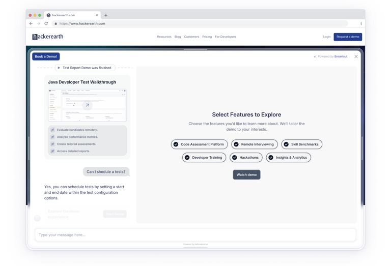
How Immersive Mode Was Born
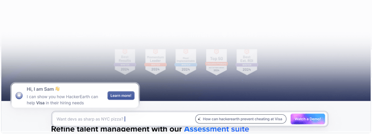
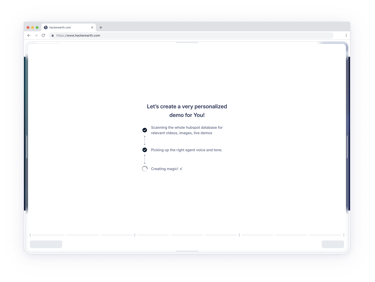
From the very beginning, we knew we wanted to show demos.
We just didn’t know how.

We tried a few directions.....
We didn’t throw this at the user immediately.
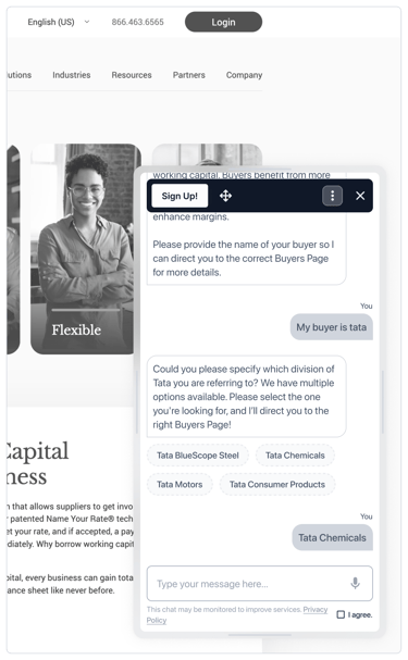
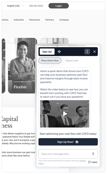
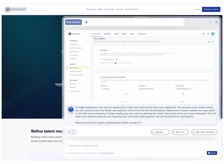
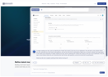
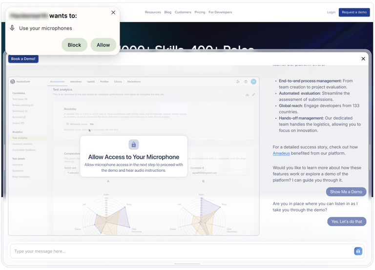
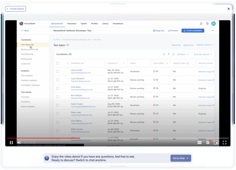
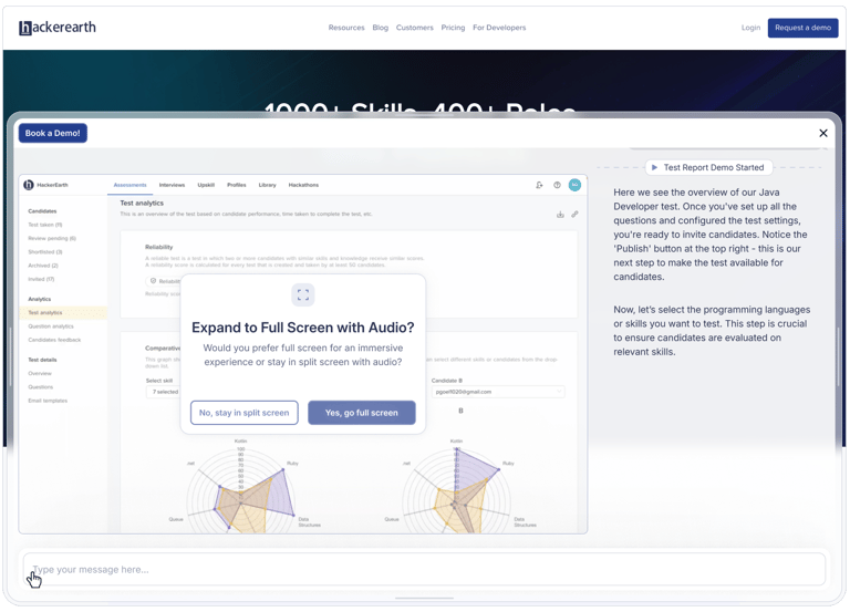
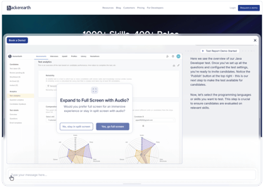
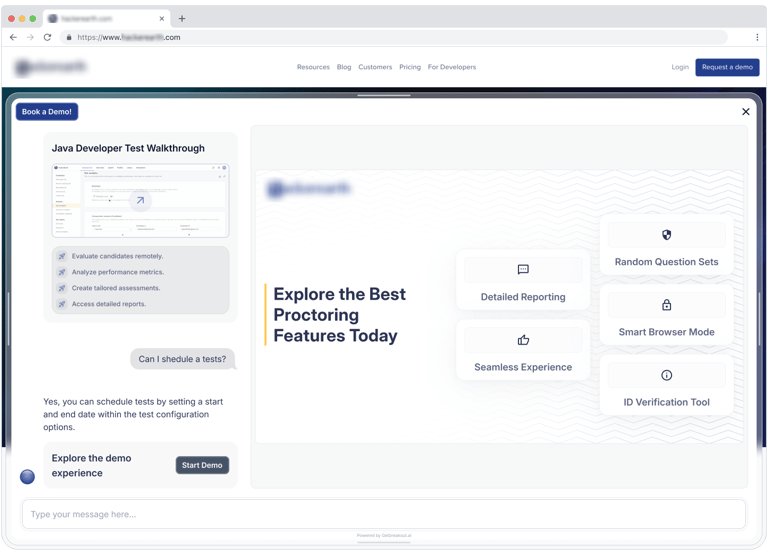
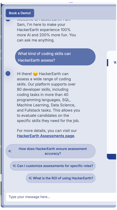
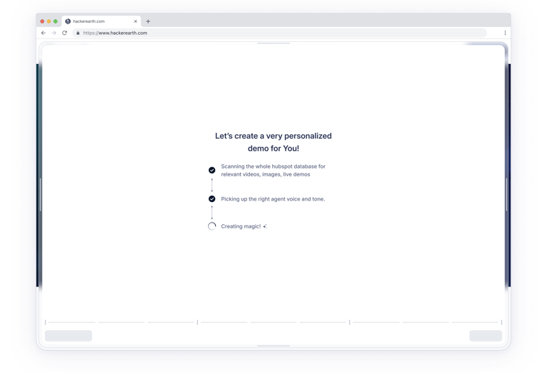
We waited until they were engaged. Then the AI would offer: “Want me to show you how it works in real time?” If they accepted, we launched Immersive Mode: a full-screen experience, voice-driven, all happening inside the browser.


Iteration & Validation

From day one, we didn’t want Breakout to feel like a foreign widget pasted onto someone’s site.
We wanted it to adapt - not just in logic, but in look and feel.
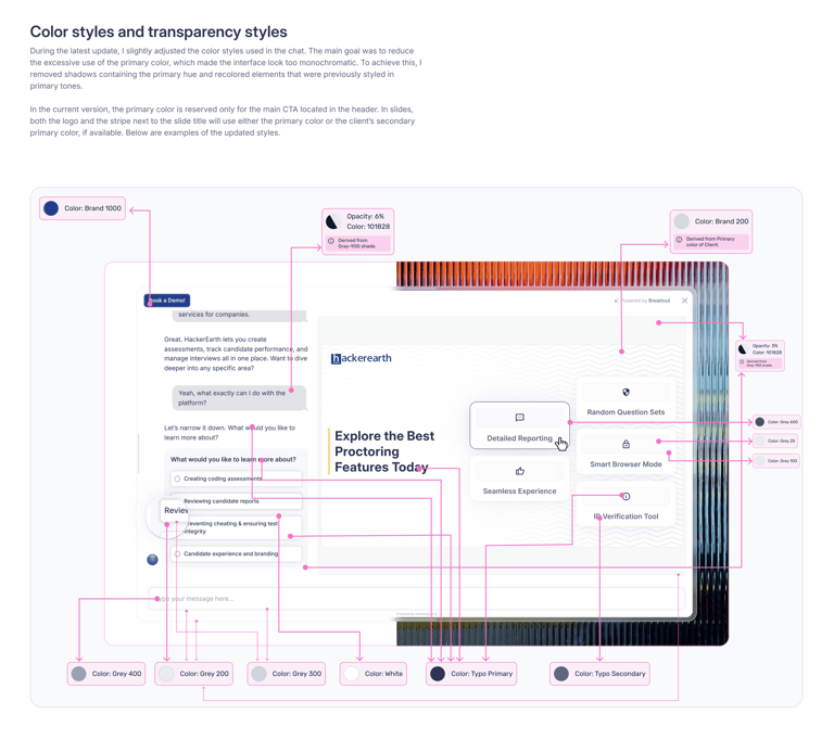
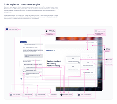
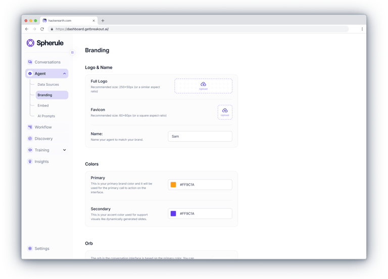
We developed a system that automatically adapted to the client’s brand:
We pulled their primary brand color,
applied varying degrees of transparency (from 90% down to 2.5%),
used a color picker to lock the resulting tones,
and created a full range of shades: 1000, 900, 800… all the way to 25.
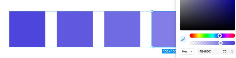
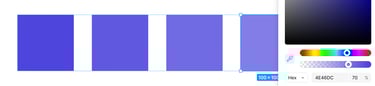
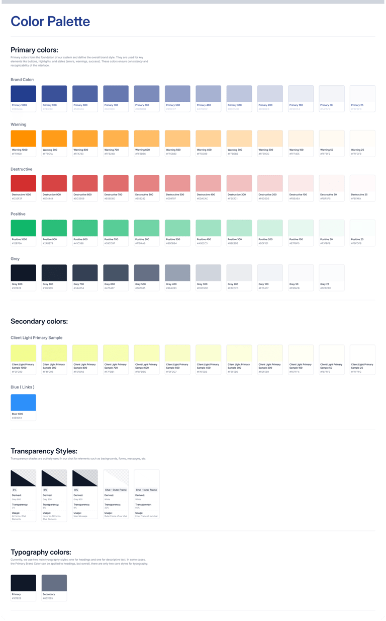
These colors were then applied to the UI:
shadows, borders, buttons, accents - everywhere they made sense.
This method allowed us to generate customized palettes for each client.
Here’s an example of what that looked like:
Reality check: what went wrong?
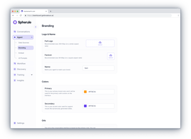
Since we had implemented a backend logic for auto-branding, the chat interface was designed to dynamically adapt based on the client’s primary color.
As soon as a color was provided, the system would automatically generate a palette and apply it across UI components — buttons, highlights, borders, and more.

It looked perfect in Figma. But once it hit real websites - chaos.
Some brands had overly light tones, others extremely saturated ones.
Contrast broke. Text became unreadable. Visuals fell apart.
Clients didn’t hold back: “This looks bad.”
The solution
I revisited the color logic and defined only the essential UI areas where the client’s primary color should be applied — to reduce overload and avoid monochromatic results.
A set of neutral shades was introduced to ensure visual consistency across all brands, resulting in a more balanced and professional look.
This shift ensured that the overall visual identity of the chat felt stable, clean, and reliable — regardless of the client’s original palette.

The result:
The interface became stable, clean, and professional on any website - regardless of how strong (or weak) the client’s brand palette is.


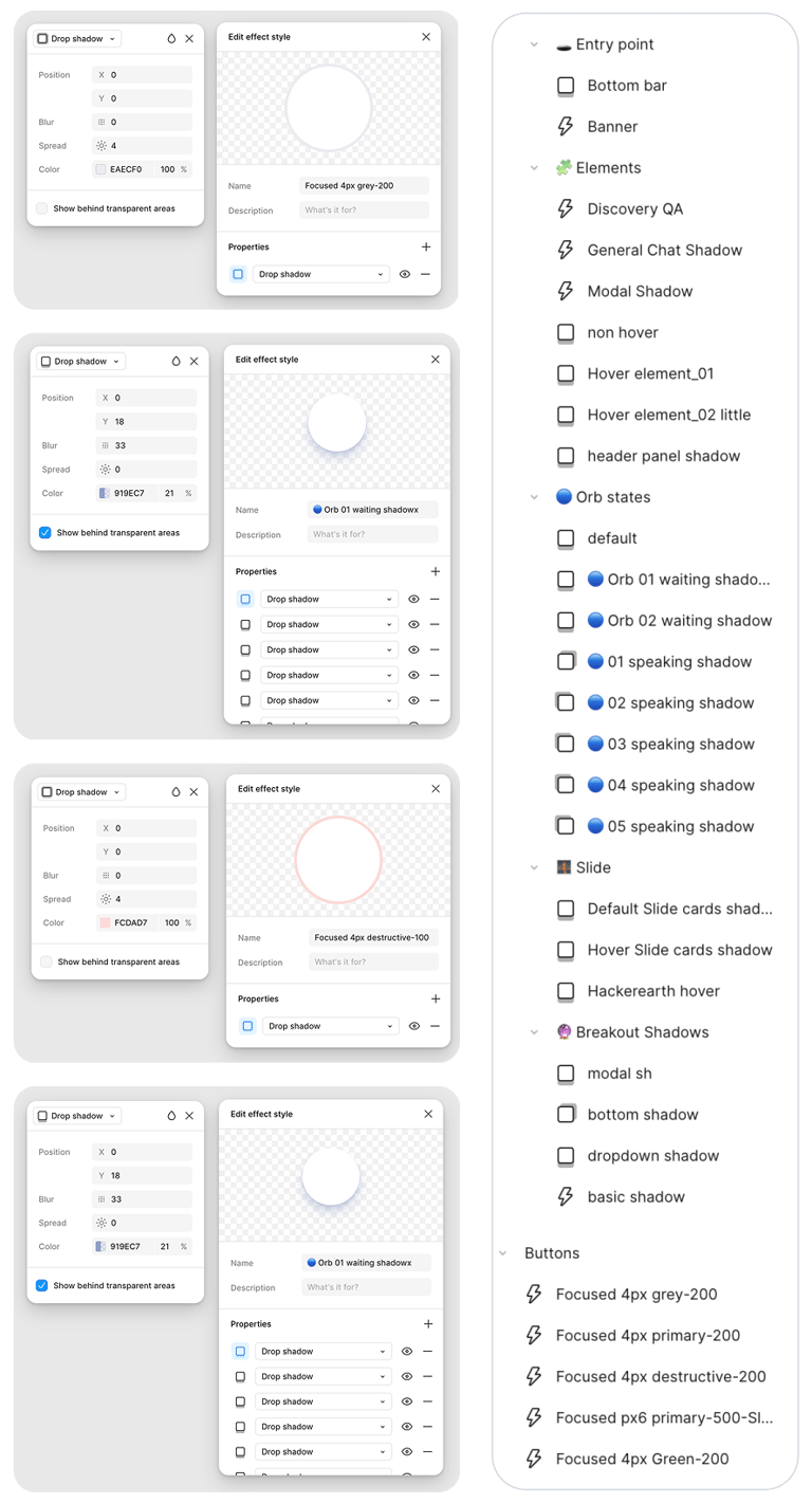
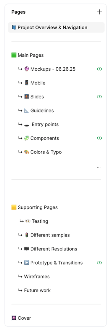
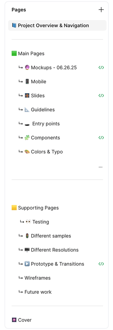
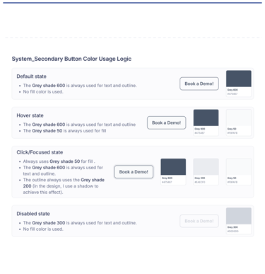
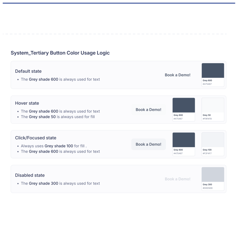
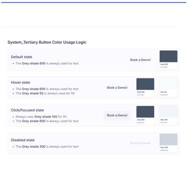
Design System & Figma Structure
To ensure stability and scalability,we built a universal design system — with a clean structure, adaptive components,and a well-organized Figma file: with an index, quick access, Guidelines and clearly divided sections for the team.
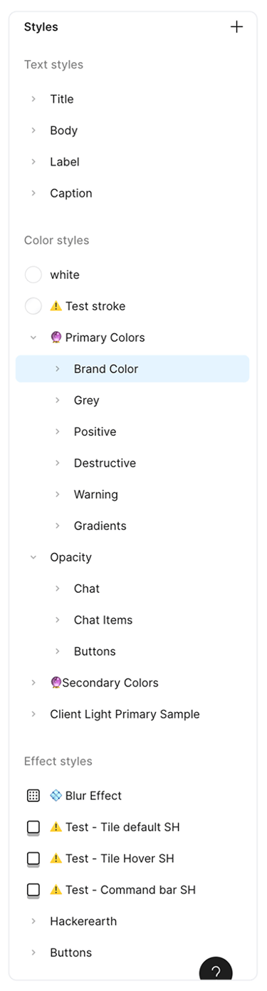
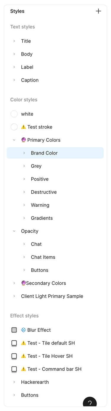

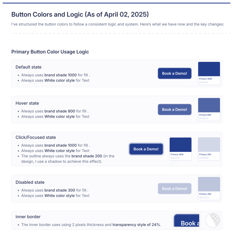
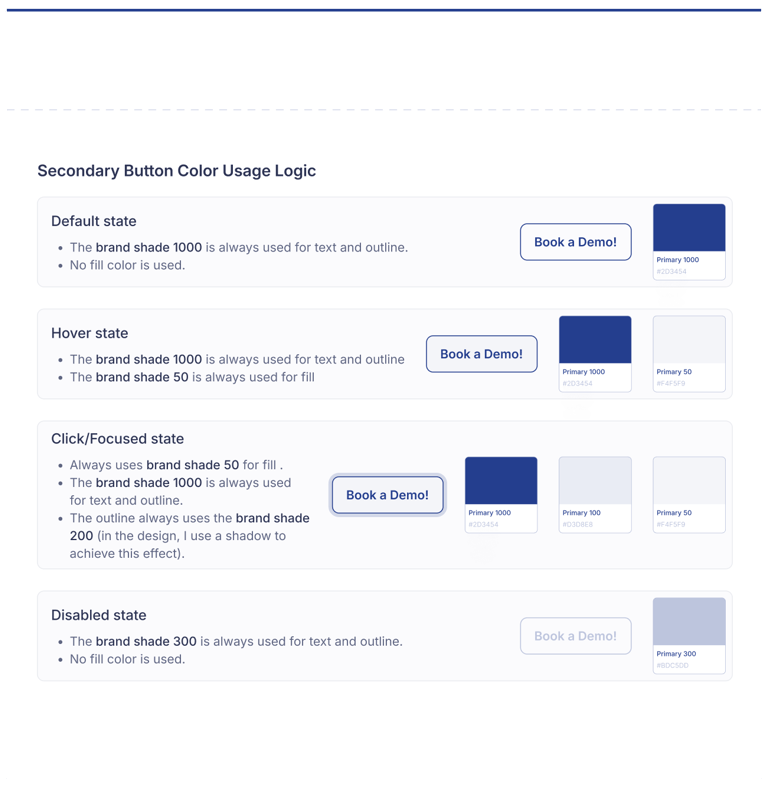
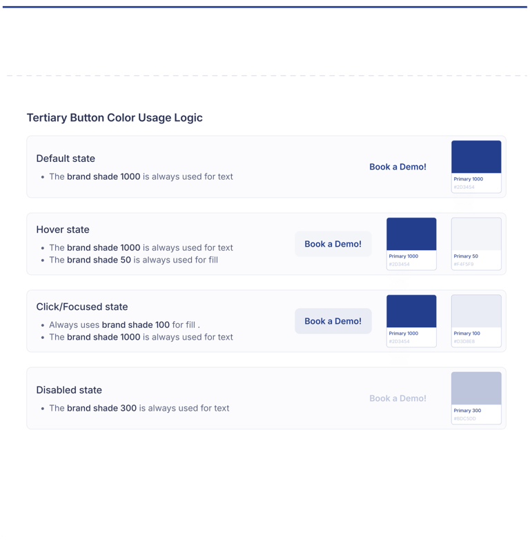
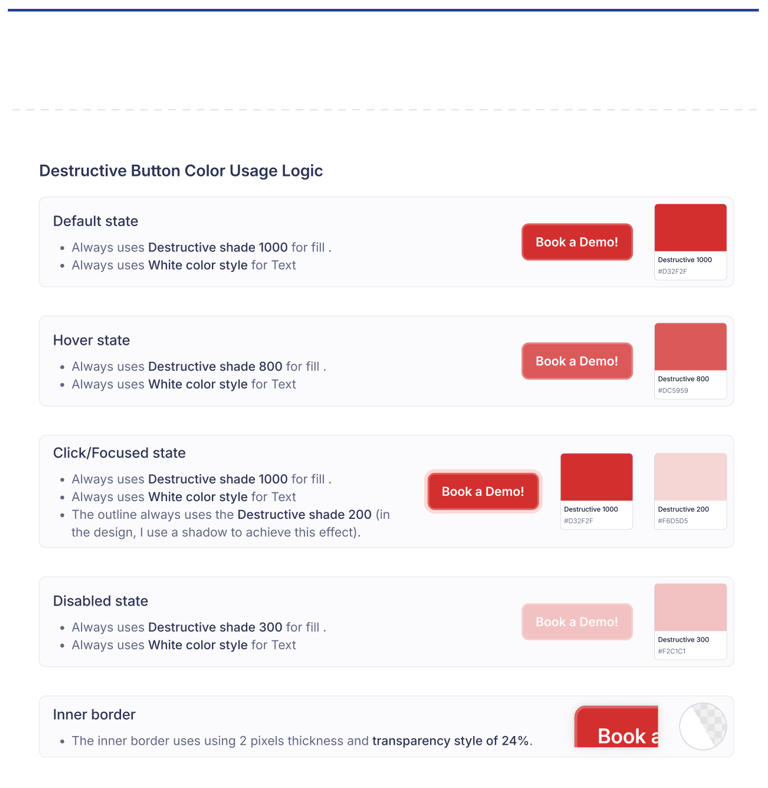
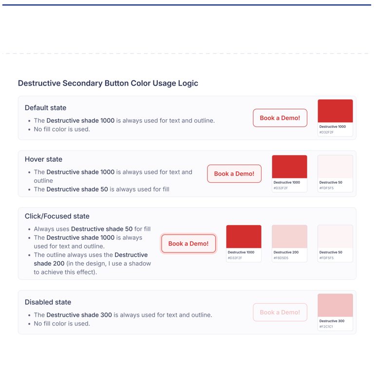
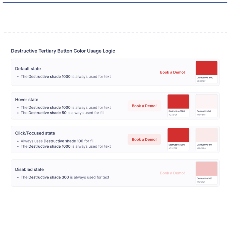
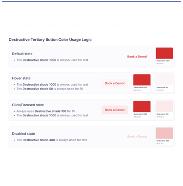
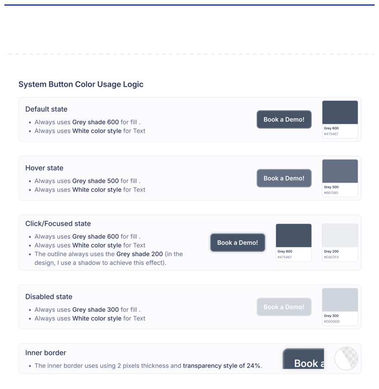
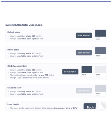
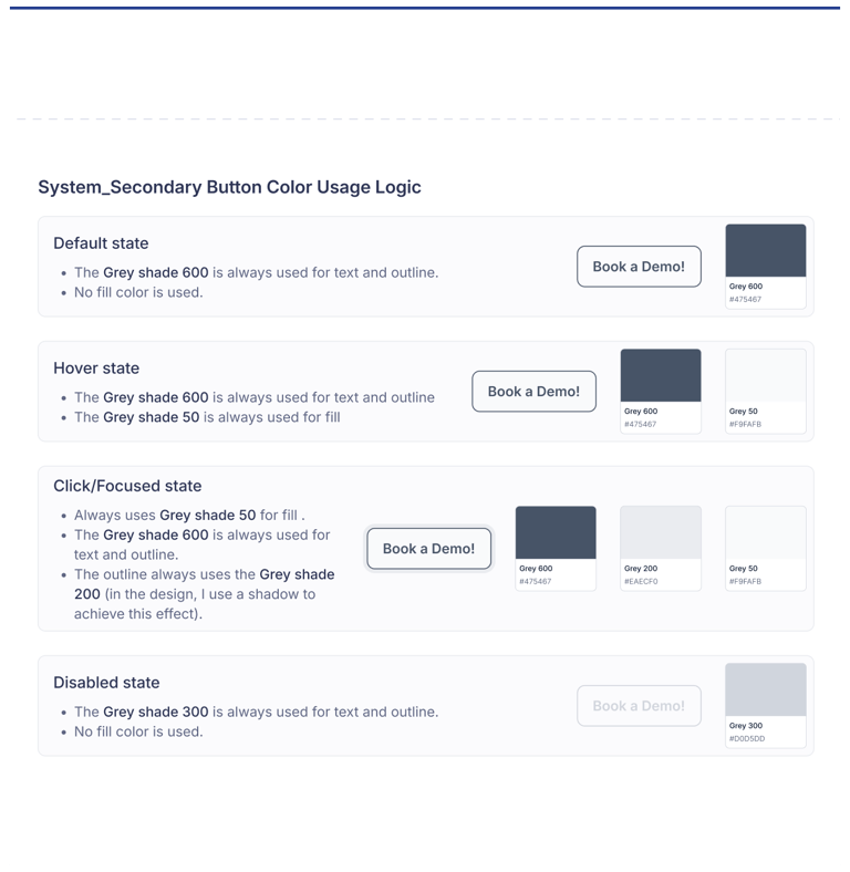
Button Colors and Logic


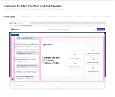
Chat Design
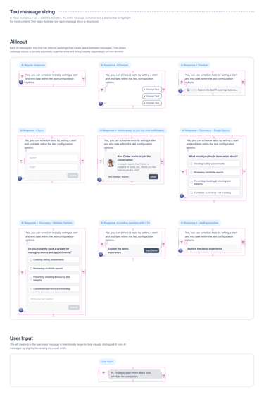
The chat had to be fast, flexible, and visually subtle - not a widget, but a seamless part of any site.We designed adaptive UI patterns for onboarding, interactions, and visual responses, making the assistant feel alive and helpful from the first second.
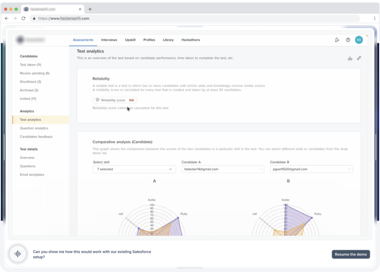
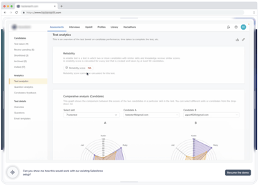
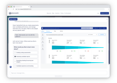
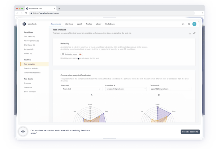
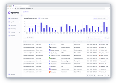
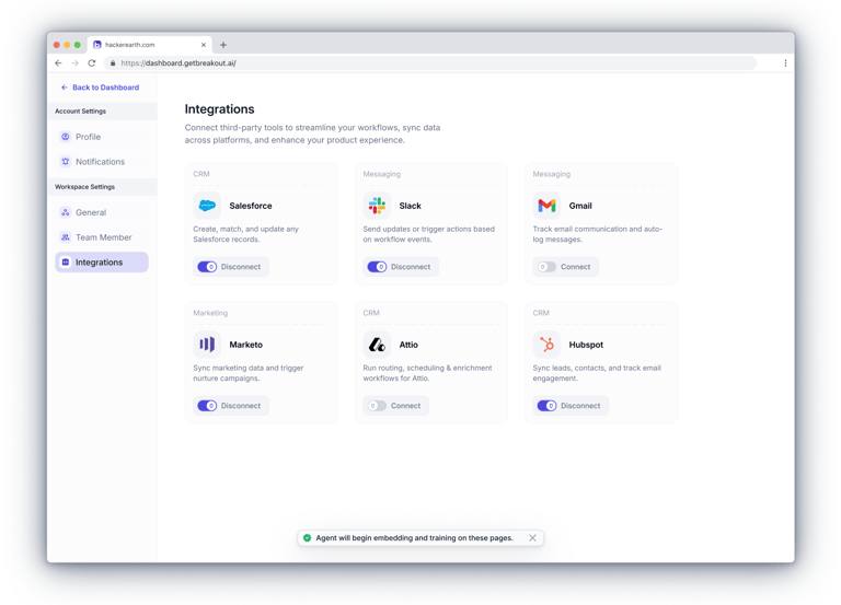
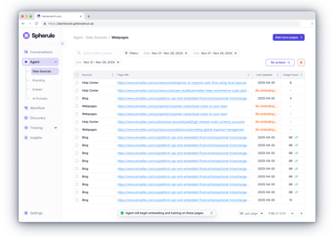
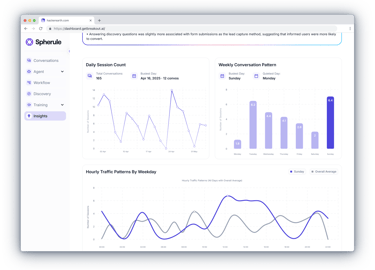
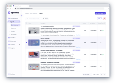
Admin Dashboard
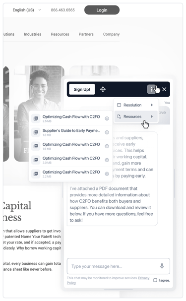
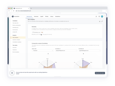
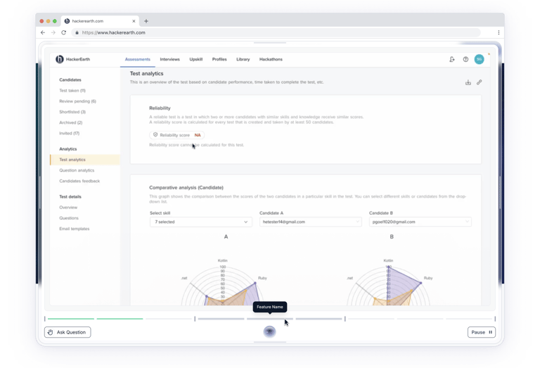
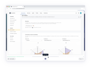
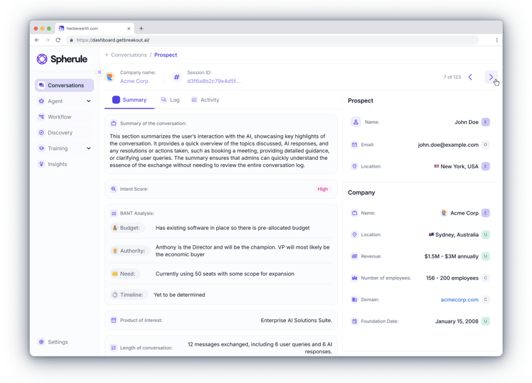
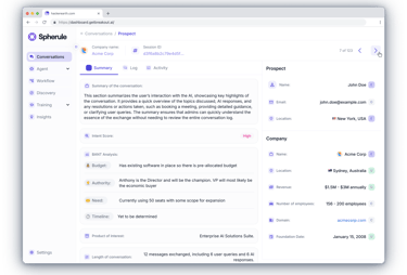
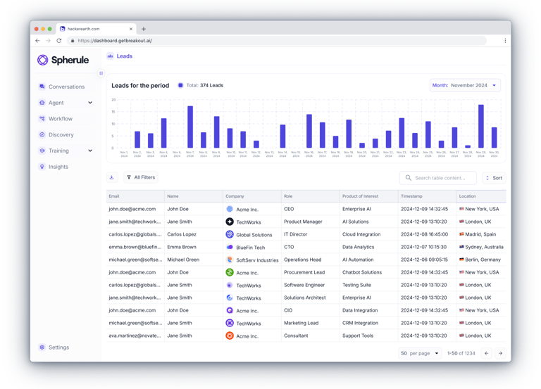
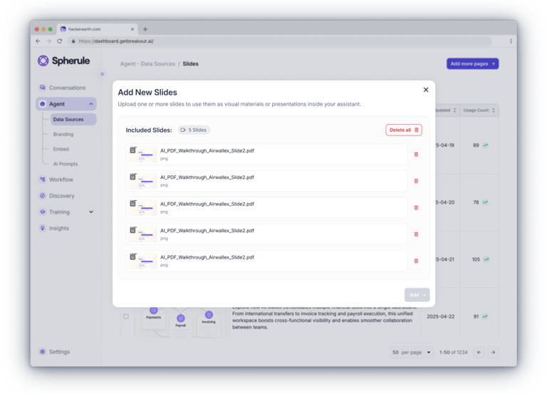
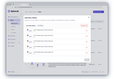
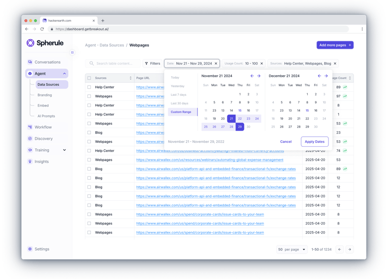
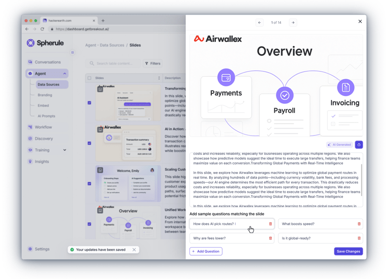
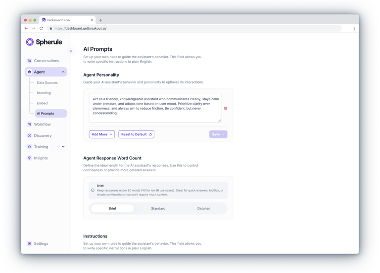
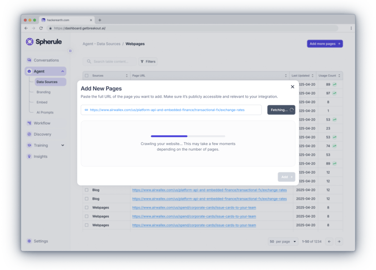
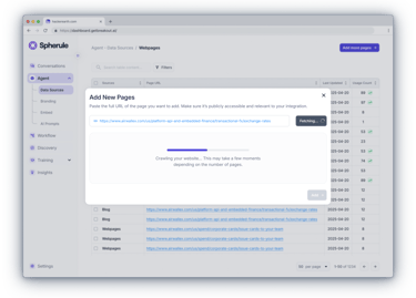
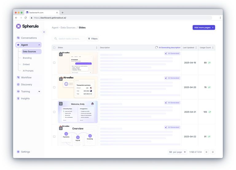
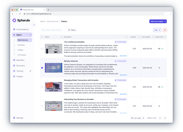
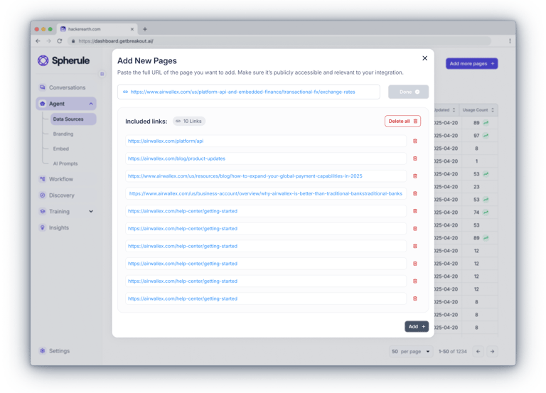
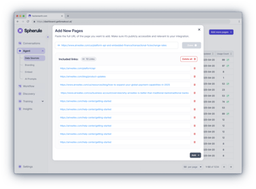
The admin dashboard brings together everything a client needs — from real-time chat monitoring and assistant customization to uploading knowledge content and managing leads.Clients can join ongoing conversations, review full histories, fine-tune the assistant’s behavior and tone of voice, and provide it with materials like documents, links, slides, and videos.All data - from user profiles to lead insights — is accessible in one place.


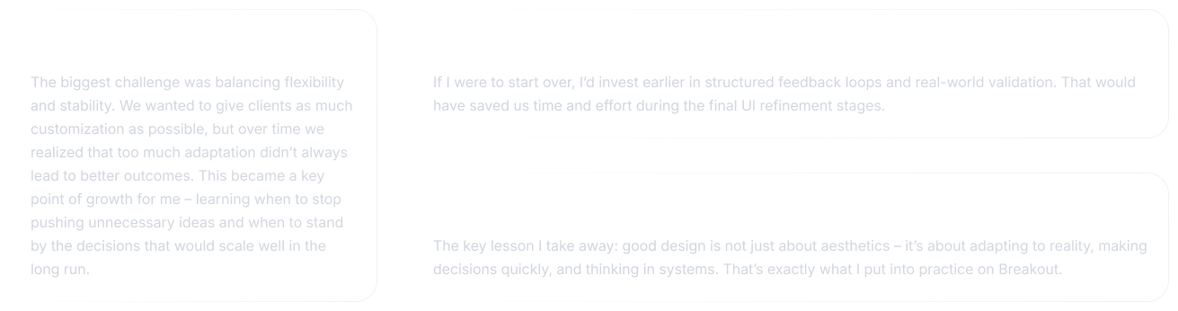
Personal Reflection
This project was more than just building a product from scratch – it was an opportunity to apply systematic design thinking to a real business challenge. I was responsible for the entire design scope: from shaping the strategy and crafting the interaction model to final visual execution and implementation.